还在为复杂的页面布局而头疼吗? GridStack.js 来拯救你!这是一个强大的拖拽网格布局库,让你的页面布局变得像搭积木一样简单!无论是仪表板、卡片布局还是响应式设计,GridStack.js 都能轻松搞定!
什么是 GridStack.js?
GridStack.js 是一个现代化的纯 TypeScript 库,专门用于创建可拖拽、可调整大小的响应式网格布局。它让你可以:
- 拖拽元素:像移动桌面图标一样自由拖拽
- 调整大小:随意调整元素尺寸
- 响应式布局:自动适配不同屏幕尺寸
- 灵活配置:支持各种自定义设置
- 无依赖设计:纯原生 JavaScript,无需 jQuery
想象一下,你可以像在手机桌面上整理应用图标一样来设计你的网页布局!
核心特性
拖拽与调整大小
- 直观拖拽:支持鼠标和触摸操作
- 智能调整:元素可以自由调整大小
- 碰撞检测:自动避免元素重叠
- 网格吸附:元素自动对齐到网格
响应式设计
- 多列布局:支持 1-12 列布局
- 断点适配:不同屏幕尺寸自动调整
- 移动端优化:完美支持触摸设备
高度可定制
- 主题支持:多种内置主题
- 动画效果:流畅的拖拽动画
- 事件系统:丰富的事件回调
- 嵌套网格:支持多层嵌套布局
️ 快速开始
安装
选择你喜欢的包管理器:
# 推荐使用 pnpm
pnpm add gridstack

# 或者使用 yarn
yarn add gridstack

# 或者使用 npm
npm install gridstack
基础使用
<template>
  <div class="grid-container">
    <div class="grid-stack" ref="gridStackRef"></div>
  </div>
</template>

<script setup>
import { ref, onMounted } from "vue";
import { GridStack } from "gridstack";
import "gridstack/dist/gridstack.min.css";

const gridStackRef = ref(null);
let grid = null;

onMounted(() => {
  // 初始化网格
  grid = GridStack.init(
    {
      column: 12, // 列数
      cellHeight: 70, // 单元格高度
      margin: "6px", // 单元格间距
      removable: false, // 是否可删除
      acceptWidgets: true, // 是否可接受外部元素
      resizable: {
        handles: "se",
      },
    },
    gridStackRef.value
  );

  const initialData = [
    { x: 0, y: 0, w: 4, h: 2, content: "1" },
    { x: 4, y: 0, w: 4, h: 4, content: "2" },
    { x: 8, y: 0, w: 2, h: 2, content: "3" },
    { x: 10, y: 0, w: 2, h: 2, content: "4" },
    { x: 0, y: 2, w: 2, h: 2, content: "5" },
    { x: 2, y: 2, w: 2, h: 4, content: "6" },
    { x: 8, y: 2, w: 4, h: 2, content: "7" },
    { x: 0, y: 4, w: 2, h: 2, content: "8" },
    { x: 4, y: 4, w: 4, h: 2, content: "9" },
    { x: 8, y: 4, w: 2, h: 2, content: "10" },
    { x: 10, y: 4, w: 2, h: 2, content: "11" },
  ];
  grid.load(initialData);
});
</script>

<style>
.grid-container {
  width: 100%;
  background: #f5f5f5;
  box-shadow: 0 0 4px rgba(0, 0, 0, 0.1);
  padding: 6px;
}
.grid-stack-item-content {
  display: flex;
  align-items: center;
  justify-content: center;
  background-color: white;
  border-radius: 8px;
  text-align: center;
}
</style>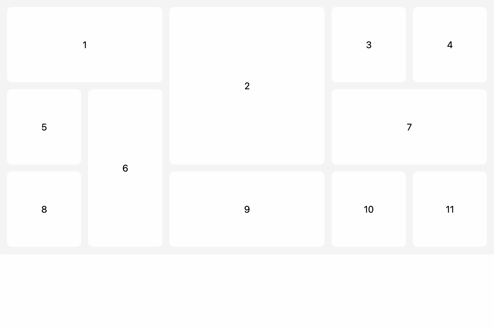
常用配置属性
以下是 GridStack 常用的基础配置属性(GridStackOptions)说明:
| 属性名 | 类型 | 说明 |
|---|---|---|
| cellHeight | number/string | 每个网格单元的高度,支持像素(如 80)、百分比(如 ‘70%’)或 ‘auto’。 |
| cellWidth | number/string | 每个网格单元的宽度,通常自动计算,特殊场景可自定义。 |
| column | number | 网格的列数,默认 12。 |
| float | boolean | 是否启用浮动布局,true 时元素可自由排列。 |
| resizable | boolean/object | 是否允许调整大小,或传递详细配置对象(如 handles)。 |
| draggable | boolean/object | 是否允许拖拽,或传递详细配置对象(如 handle、cancel)。 |
| margin | number/string | 网格项之间的间距,支持像素或百分比。 |
| minRow | number | 网格的最小行数。 |
| maxRow | number | 网格的最大行数。 |
| animate | boolean | 拖拽/调整大小时是否启用动画。 |
| removable | boolean/string | 是否允许通过拖出网格删除元素,或指定删除区域的选择器。 |
| acceptWidgets | boolean/string/function | 是否允许拖入外部元素,或指定选择器/函数。 |
| disableResize | boolean | 是否全局禁用调整大小。 |
| disableDrag | boolean | 是否全局禁用拖拽。 |
以下是 GridStackWidget(网格项)常用的基础属性说明:
| 属性名 | 类型 | 说明 |
|---|---|---|
| x | number | 网格项的起始列(从 0 开始计数)。 |
| y | number | 网格项的起始行(从 0 开始计数)。 |
| w | number | 网格项占据的列数(宽度)。 |
| h | number | 网格项占据的行数(高度)。 |
| minW | number | 网格项允许的最小列数。 |
| maxW | number | 网格项允许的最大列数。 |
| minH | number | 网格项允许的最小行数。 |
| maxH | number | 网格项允许的最大行数。 |
| id | string/number | 网格项唯一标识(可选,便于后续查找和操作)。 |
| locked | boolean | 是否锁定该网格项,锁定后无法拖拽和调整大小。 |
| noResize | boolean | 是否禁止该网格项调整大小。 |
| noMove | boolean | 是否禁止该网格项拖拽移动。 |
| autoPosition | boolean | 是否自动寻找空位插入该网格项(通常用于动态添加时)。 |
| content | string/HTMLElement | 网格项的内容(可选,实际开发中通常为插槽或自定义内容)。 |
进阶用法
content 渲染 html 标签
<template>
  <div class="grid-container">
    <div class="grid-stack" ref="gridStackRef"></div>
  </div>
</template>

<script setup>
import { ref, onMounted } from "vue";
import { GridStack } from "gridstack";
import "gridstack/dist/gridstack.min.css";

const gridStackRef = ref(null);
let grid = null;

onMounted(() => {
  // 初始化网格
  grid = GridStack.init(
    {
      column: 12, // 列数
      cellHeight: 70, // 单元格高度
      margin: "6px", // 单元格间距
      removable: false, // 是否可删除
      acceptWidgets: true, // 是否可接受外部元素
      resizable: {
        handles: "se",
      },
    },
    gridStackRef.value
  );

  const initialData = [
    { x: 0, y: 0, w: 4, h: 2, content: "<strong>粗体文本</strong>" },
    { x: 4, y: 0, w: 4, h: 4, content: "<em>斜体文本</em>" },
    {
      x: 8,
      y: 0,
      w: 2,
      h: 2,
      content: "<span style='color: red;'>红色文本</span>",
    },
    {
      x: 10,
      y: 0,
      w: 2,
      h: 2,
      content:
        "<div style='background: yellow; padding: 5px;'>带背景的文本</div>",
    },
    { x: 0, y: 2, w: 2, h: 2, content: "5" },
    { x: 2, y: 2, w: 2, h: 4, content: "6" },
    { x: 8, y: 2, w: 4, h: 2, content: "7" },
    { x: 0, y: 4, w: 2, h: 2, content: "8" },
    { x: 4, y: 4, w: 4, h: 2, content: "9" },
    { x: 8, y: 4, w: 2, h: 2, content: "10" },
    { x: 10, y: 4, w: 2, h: 2, content: "11" },
  ];

  // 先加载数据,然后手动设置 HTML 内容
  grid.load(initialData);

  // 等待 DOM 更新后,手动设置每个项目的 HTML 内容
  setTimeout(() => {
    const gridItems = grid.getGridItems();
    initialData.forEach((item, index) => {
      if (gridItems[index]) {
        const contentEl = gridItems[index].querySelector(
          ".grid-stack-item-content"
        );
        if (contentEl) {
          contentEl.innerHTML = item.content || "";
        }
      }
    });
  }, 100);
});
</script>

<style>
.grid-container {
  width: 100%;
  background: #f5f5f5;
  box-shadow: 0 0 4px rgba(0, 0, 0, 0.1);
  padding: 6px;
}
.grid-stack-item-content {
  display: flex;
  align-items: center;
  justify-content: center;
  background-color: white;
  border-radius: 8px;
  text-align: center;
}
</style>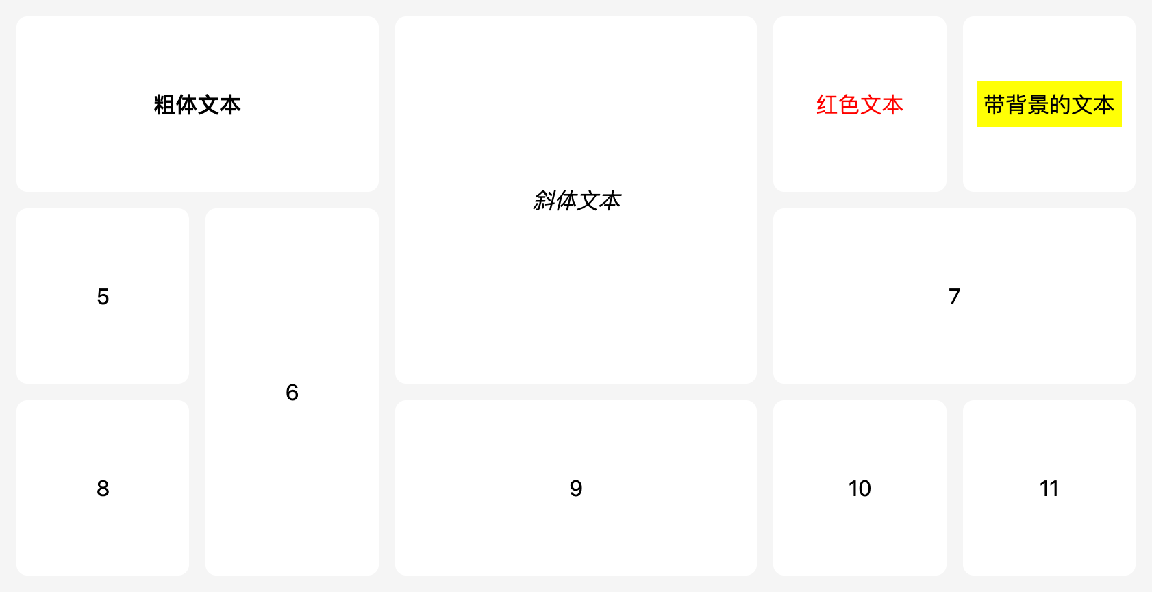
可调整大小/可拖动句柄
GridStack.init(
  {
    // 可调整大小
    resizable: {
      handles: "se,sw,ne,nw", // 拖拽方向 se-右下角,sw-左下角,ne-右上角,nw-左上角
    },
  },
  gridStackRef.value
);
禁用拖拽
GridStack.addWidget({
  x: 0,
  y: 0,
  w: 4,
  h: 2,
  content: "禁用拖拽",
  noMove: true,
});
禁用调整大小
GridStack.addWidget({
  x: 0,
  y: 0,
  w: 4,
  h: 2,
  content: "禁用调整大小",
  noResize: true,
});
锁定网格项
GridStack.addWidget({
  x: 0,
  y: 0,
  w: 4,
  h: 2,
  content: "锁定网格项",
  locked: true,
});
最佳实践
1. 性能优化
// 批量更新,避免频繁重绘
grid.batchUpdate();
grid.addWidget({ w: 2, h: 1, content: "元素1" });
grid.addWidget({ w: 2, h: 1, content: "元素2" });
grid.addWidget({ w: 2, h: 1, content: "元素3" });
grid.batchUpdate(false); // 结束批量更新
2. 内存管理
// 组件销毁时清理资源
onUnmounted(() => {
  if (grid) {
    grid.destroy();
    grid = null;
  }
});
3. 响应式设计
// 根据屏幕尺寸调整配置
const getGridConfig = () => {
  const width = window.innerWidth;
  return {
    column: width < 768 ? 4 : width < 1024 ? 8 : 12,
    cellHeight: width < 768 ? 60 : 80,
    margin: width < 768 ? 8 : 15,
  };
};
总结
GridStack.js 是一个功能强大、易于使用的网格布局库,特别适合:
- 仪表板应用:数据可视化面板
- 内容管理:拖拽式页面构建器
- 响应式设计:多设备适配
- 原型设计:快速布局验证
主要优势:
- ✅ 零依赖:纯原生 JavaScript
- ✅ 高性能:优化的渲染机制
- ✅ 易上手:简单的 API 设计
- ✅ 可扩展:丰富的配置选项
- ✅ 跨平台:支持所有现代浏览器
现在就开始使用 GridStack.js,让你的页面布局变得像搭积木一样简单吧!
小贴士:
GridStack.js 不仅支持 Vue 3,还支持 React、Angular 等主流框架。无论你使用什么技术栈,都能轻松集成!
相关链接:
原文链接:https://code.ifrontend.net/archives/1371,转载请注明出处。


评论0