概述
在 Vite 7 + Vue 3 项目中使用 vite-plugin-svg-icons 插件来管理和使用 SVG 图标的完整解决方案。通过该插件,可以实现 SVG 图标的按需加载、统一管理、自定义样式等功能,提供了一个高效且灵活的 SVG 图标系统。
vite-plugin-svg-icons 插件
vite-plugin-svg-icons 是一个专门为 Vite 打造的 SVG 图标解决方案,具有以下特点:
- 按需加载: 只加载当前页面需要使用的图标,减少资源请求
- 自动打包: 将所有 SVG 图标打包成 SVG Sprite,减少网络请求
- 缓存优化: 支持浏览器缓存,提高加载性能
- 灵活配置: 提供丰富的配置选项,满足不同场景需求
- TypeScript: 完整的 TypeScript 类型支持
- 开发友好: 支持热更新,开发体验优秀
安装依赖
npm install vite-plugin-svg-icons -D项目结构
src/
├── assets/
│   └── icons/
│       ├── shoucang.svg
│       ├── dianzan.svg
│       └── fenxiang.svg
│       └── dashang.svg
├── components/
│   └── SvgIcon.vue
└── main.js
Vite 配置
// vite.config.js
import { defineConfig } from "vite";
import vue from "@vitejs/plugin-vue";
import { createSvgIconsPlugin } from "vite-plugin-svg-icons";
import path from "path";

export default defineConfig({
  plugins: [
    vue(),
    createSvgIconsPlugin({
      // 指定需要缓存的图标文件夹
      iconDirs: [path.resolve(process.cwd(), "src/assets/icons")],
      // 指定symbolId格式
      symbolId: "icon-[dir]-[name]",
      // 自定义插入位置
      inject: "body-last",
      // 自定义dom id
      customDomId: "__svg__icons__dom__",
    }),
  ],
  resolve: {
    alias: {
      "@": path.resolve(__dirname, "src"),
    },
  },
});
入口文件配置
// main.js
import { createApp } from "vue";
import App from "./App.vue";

// 引入svg注册脚本
import "virtual:svg-icons-register";

const app = createApp(App);
app.mount("#app");
SVG 图标组件
<!-- components/SvgIcon.vue -->
<template>
  <svg
    :class="svgClass"
    :style="{ width: size, height: size }"
    aria-hidden="true"
  >
    <use :href="iconName" :fill="color" />
  </svg>
</template>

<script setup>
import { computed } from "vue";

const props = defineProps({
  name: {
    type: String,
    required: true,
  },
  size: {
    type: [String, Number],
    default: "16px",
  },
  color: {
    type: String,
    default: "currentColor",
  },
  className: {
    type: String,
    default: "",
  },
});

const iconName = computed(() => `#icon-${props.name}`);
const svgClass = computed(() => {
  if (props.className) {
    return `svg-icon ${props.className}`;
  }
  return "svg-icon";
});
</script>

<style scoped>
.svg-icon {
  display: inline-block;
  vertical-align: middle;
  fill: currentColor;
  overflow: hidden;
}
</style>
使用示例
<!-- App.vue -->
<template>
  <div class="min-h-screen bg-gray-50 py-8">
    <div class="max-w-4xl mx-auto px-4">
      <div class="space-y-2">
        <!-- 收藏 -->
        <div class="text-center">
          <h1 class="text-3xl font-bold text-gray-800 mb-4">收藏</h1>
          <div class="flex items-center justify-center gap-8">
            <SvgIcon name="shoucang" size="32px" color="#ff6b6b" />
            <SvgIcon name="shoucang" size="64px" color="#ff6b6b" />
            <SvgIcon name="shoucang" size="96px" color="#ff6b6b" />
            <SvgIcon name="shoucang" size="128px" color="#ff6b6b" />
          </div>
        </div>

        <!-- 点赞 -->
        <div class="text-center">
          <h1 class="text-3xl font-bold text-gray-800 mb-4">点赞</h1>
          <div class="flex items-center justify-center gap-8">
            <SvgIcon name="dianzan" size="32px" color="#3b82f6" />
            <SvgIcon name="dianzan" size="64px" color="#3b82f6" />
            <SvgIcon name="dianzan" size="96px" color="#3b82f6" />
            <SvgIcon name="dianzan" size="128px" color="#3b82f6" />
          </div>
        </div>

        <!-- 分享 -->
        <div class="text-center">
          <h1 class="text-3xl font-bold text-gray-800 mb-4">分享</h1>
          <div class="flex items-center justify-center gap-8">
            <SvgIcon name="fenxiang" size="32px" color="#10b981" />
            <SvgIcon name="fenxiang" size="64px" color="#10b981" />
            <SvgIcon name="fenxiang" size="96px" color="#10b981" />
            <SvgIcon name="fenxiang" size="128px" color="#10b981" />
          </div>
        </div>

        <!-- 打赏 -->
        <div class="text-center">
          <h1 class="text-3xl font-bold text-gray-800 mb-4">打赏</h1>
          <div class="flex items-center justify-center gap-8">
            <SvgIcon name="dashang" size="32px" color="#f59e0b" />
            <SvgIcon name="dashang" size="64px" color="#f59e0b" />
            <SvgIcon name="dashang" size="96px" color="#f59e0b" />
            <SvgIcon name="dashang" size="128px" color="#f59e0b" />
          </div>
        </div>

        <!-- 添加类名 -->
        <div class="text-center">
          <h1 class="text-3xl font-bold text-gray-800 mb-4">打赏</h1>
          <div class="flex items-center justify-center gap-8">
            <SvgIcon name="shoucang" size="32px" className="custom-icon" />
            <SvgIcon name="dianzan" size="32px" className="custom-icon" />
            <SvgIcon name="fenxiang" size="32px" className="custom-icon" />
            <SvgIcon name="dashang" size="32px" className="custom-icon" />
          </div>
        </div>
      </div>
    </div>
  </div>
</template>

<script setup>
import SvgIcon from "@/components/SvgIcon.vue";
</script>

<style scoped>
:deep(.custom-icon:hover) {
  transform: scale(1.2);
  fill: #007bff !important;
}

:deep(.custom-icon:hover path) {
  fill: #007bff !important;
}

:deep(.custom-icon:hover *) {
  fill: #007bff !important;
}
</style>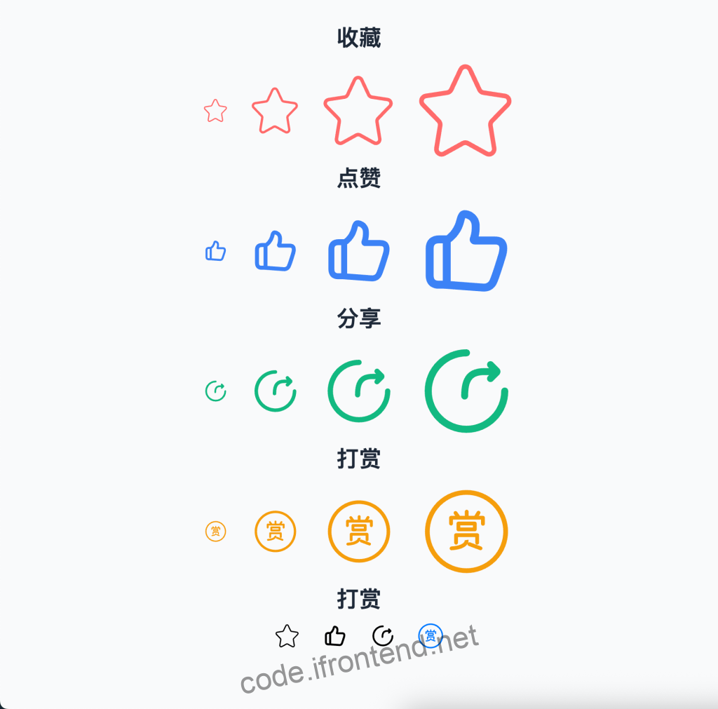
常见问题
- 图标不显示:检查 SVG 文件路径是否正确,确认 vite-plugin-svg-icons 配置正确,检查是否正确引入
virtual:svg-icons-register。 - 图标颜色无法修改:确保 SVG 文件中没有硬编码的
fill属性,使用fill="currentColor"或移除fill属性。
原文链接:https://code.ifrontend.net/archives/878,转载请注明出处。


评论0